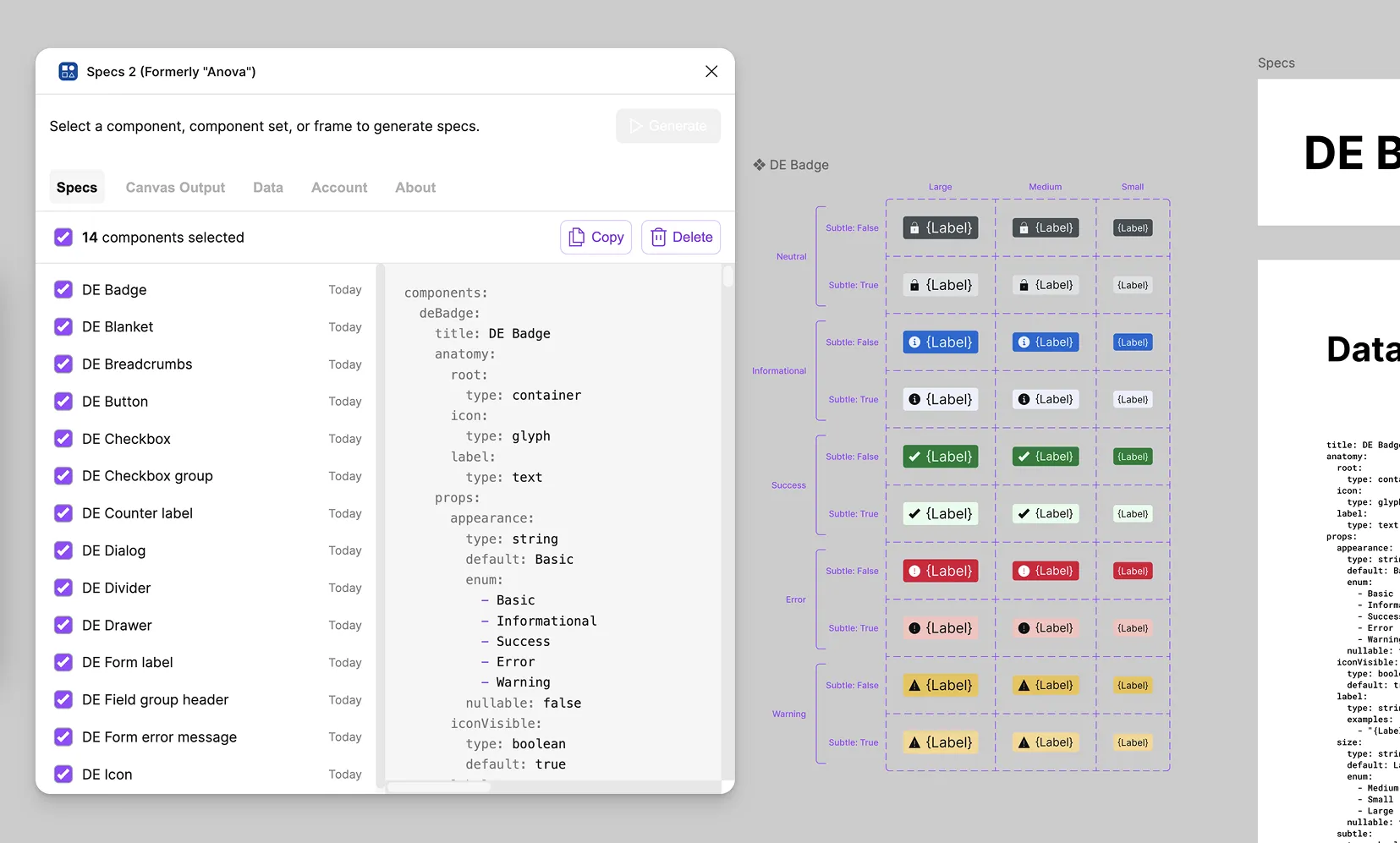
Specs 2 Figma Plugin
Select a component. Click Generate. Get a complete, structured specification — anatomy, props, layout, modes, styling, and raw data — drawn directly in Figma.
One click, six sections
Generate a complete picture of the component, in exhaustive visual detail
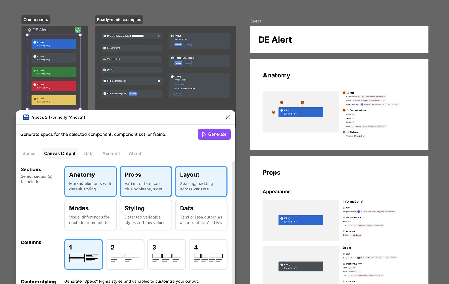
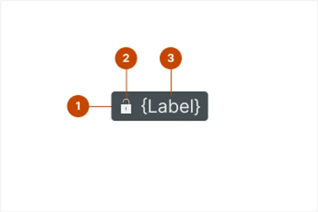 Anatomy Numbered markers annotate every element, with key attributes listed alongside
 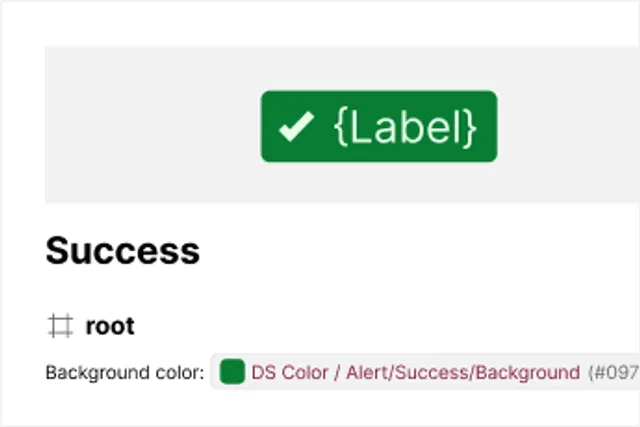 Props Every property, its options, and exactly what changes on the canvas when it's set
 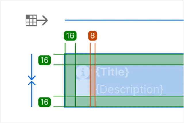 Layout Direction, alignment, resizing, padding, and spacing annotated directly on the artwork
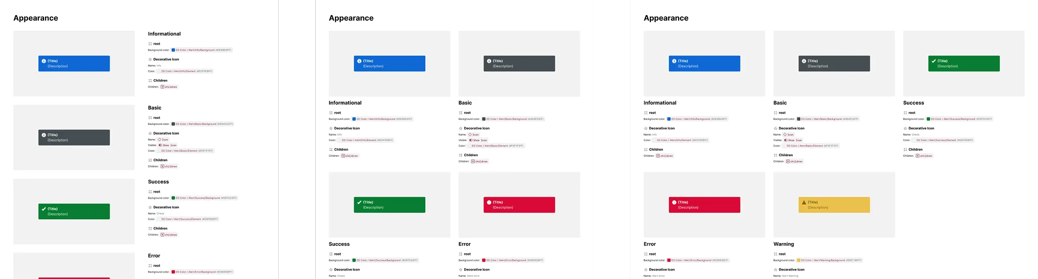
 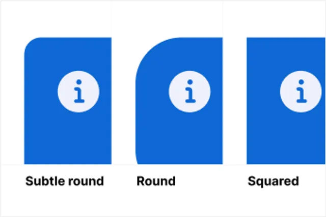 Modes Side-by-side exhibits for every light/dark or other variable mode the component uses
 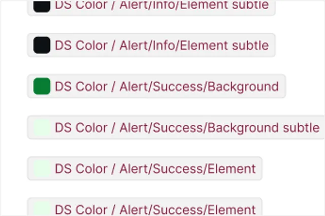 Styling Every detected variable and style, what role it plays, and where it's applied
 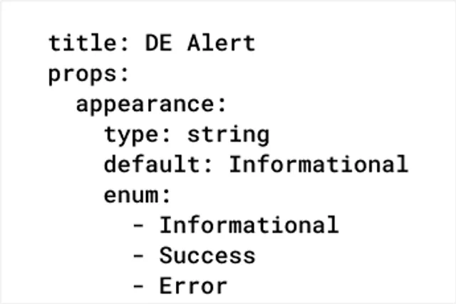 Data The same spec as structured YAML or JSON — a ready-made contract for AI/LLM tools
 Format it to match your system
Reshape the spec styling — not just what it contains, but how it looks
Color Bind specs to variables that alias to your library
Dark Mode Show specs in Light and Dark mode at any level
Spacing Customize spec spacing to use your variables
Text Apply text styles so output matches your typography
Also, Multi-Column Layout reshapes how a spec’s exhibits are arranged — tiling them into a 2, 3, or 4-column grid instead of one long column — so a spec reads well whether it’s a quick one-off or a dense reference sheet.
Tailor specs to your conventions
Set specs to match how you name and model components and systems in Figma
Settings go beyond how elements are detected — they cover every stage, from what counts as a match to how the resulting data itself is formatted.
- Format: Tokens, color values, data format, key values
- Variants: variant depth, empty variants, invalid variants, invalid combinations
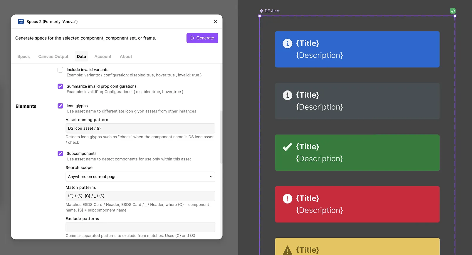
- Elements: icon glyphs, subcomponents, collapsed wrappers, default slot content, instance examples
- Props: code-only props, slot constraints, inferred number props
- Layout: layout representation
Deliver data into agentic workflows
Copy specs into LLMs chats as components change