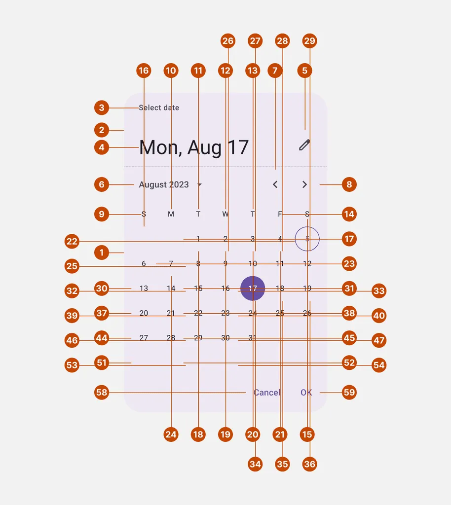
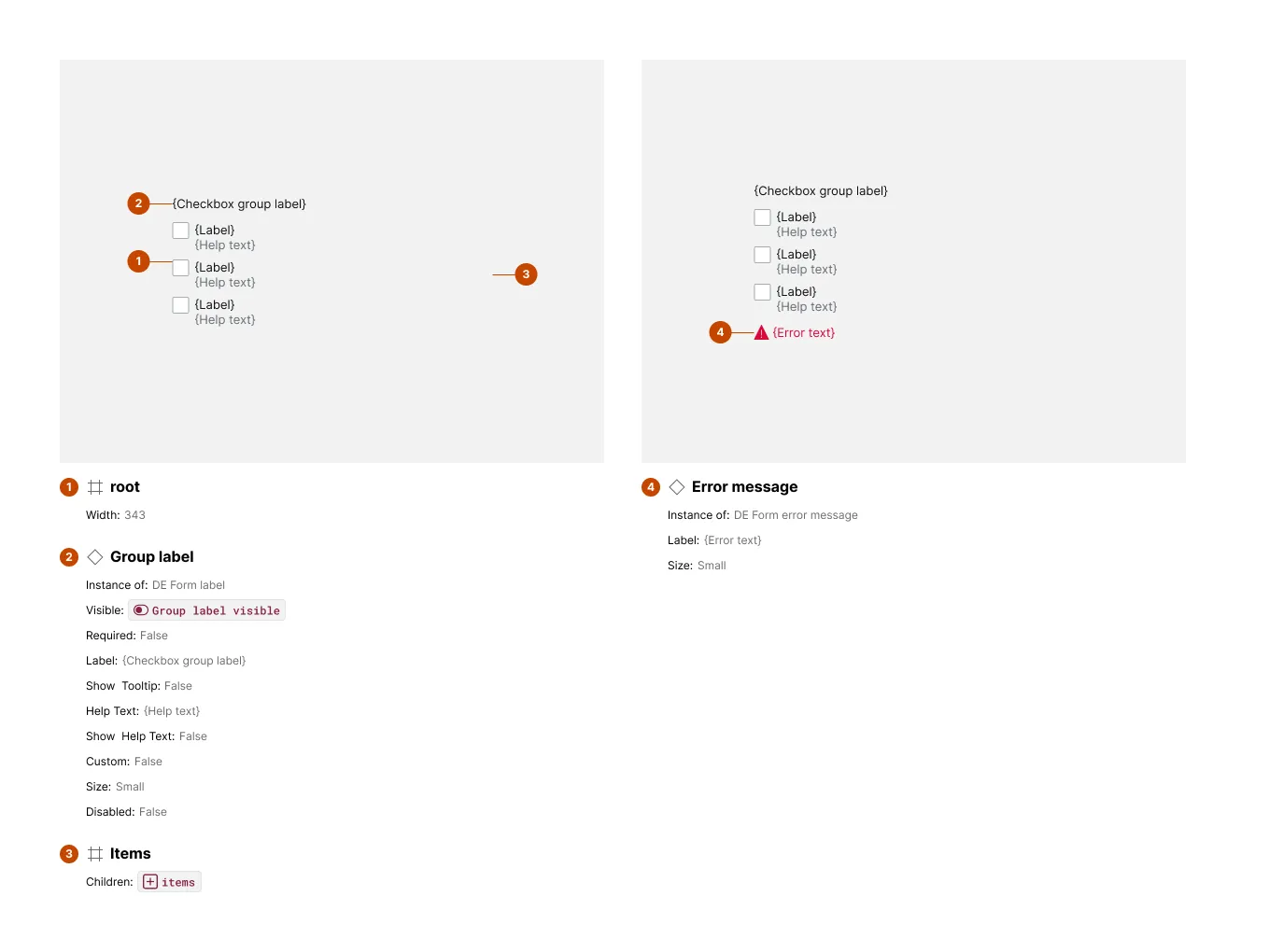
Anatomy
The Anatomy section provides a labeled breakdown of a component, including a component copy, numbered markers over meaningful parts, and a list naming and listing styles and bindings of each part.
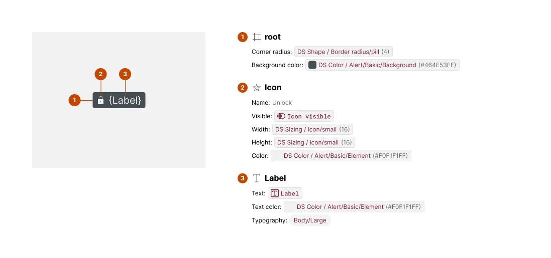
What It Includes
The artwork includes:
- Component instance — a copy of the component’s default
- Numbered markers — over each uniquely named element
The content includes:
- Numbered Element — matching every marked element by number
- Attributes — of styles like color, size, corner radius, strokes, effects, and typography in their default values
- Bindings — of text, boolean, instance swap and slot props
Additional variant exhibits are included whenever a new, uniquely named layer is detected.
Related Settings
- Variant Depth — More depth means more variant exhibits to check for revealed elements
- Glyph Name Pattern — Matched icon layers get typed as glyphs with resolved names
- Subcomponents — Discovered subcomponents get their own separate Anatomy exhibits
- Collapse Primitive Wrapper — Strips wrapper containers, changing the root element markers
Examples
Multiple Anatomy Blocks
When a component has variants that reveal elements hidden by default — like an error message that only appears in an “error” state — Specs adds a second exhibit just for that variant. It shows only the newly revealed elements, so nothing already shown gets repeated.
When Anatomy Gets Crowded
Components with many small, tightly packed, or visually similar elements can produce an exhibit that’s harder to read than it is useful — overlapping markers and a long, repetitive attribute list. In these cases, treat Anatomy as a starting point rather than the full picture, and cross-reference the component’s other spec sections for the details that got crowded out.