Layout
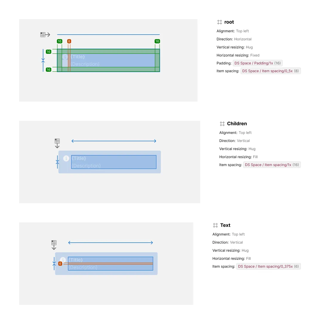
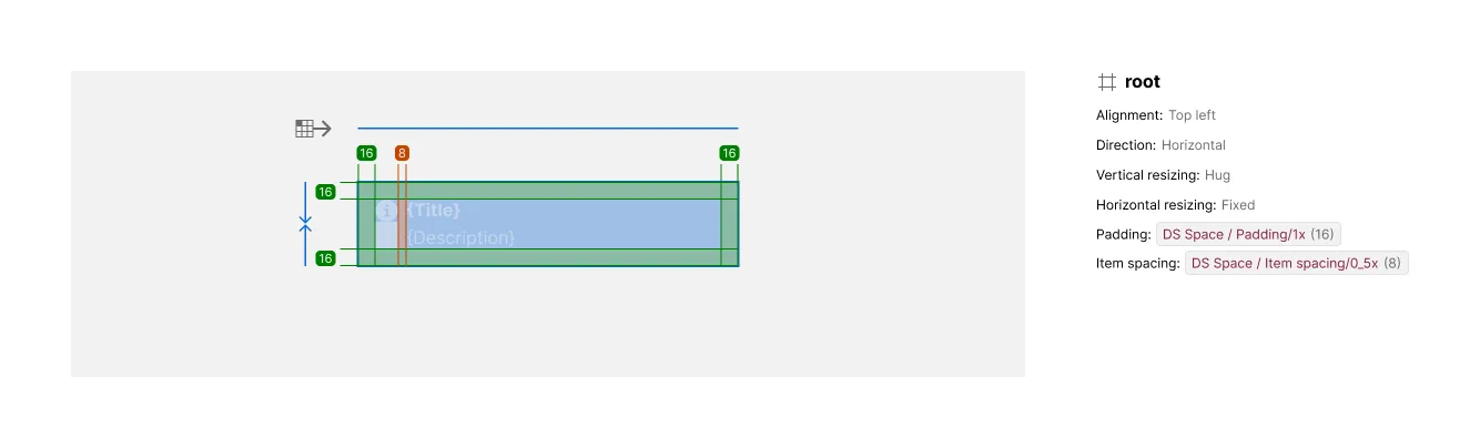
The Layout section provides an annotated breakdown of a component’s auto-layout containers, including direction, alignment, resizing, padding, and spacing markers over the artwork, with a matching content list per container.
What It Includes
The artwork includes:
- Direction arrow — whether a container lays out horizontally or vertically, including wrap
- Alignment icon — how children are aligned on both axes (e.g. “Top left”, “Middle center”, “Spaced equally”)
- Resizing markers — separate vertical and horizontal markers showing whether a container is fixed, hugging, or filling
- Padding markers — a marker per side (top, bottom, start, end) with its value, only shown where padding is greater than zero
- Item spacing markers — markers between children showing the gap distributed along the axis
The content includes:
- Layout Content list — a text list pairing each annotated container with its direction, alignment, resizing, padding, and spacing values
Additional container exhibits are included for each nested, non-instance auto-layout container using horizontal or vertical layout; instance elements and Grid-layout containers don’t get their own exhibit. Additional variant subsections appear whenever layout-relevant properties change.
Related Settings
- Variant Depth — Controls how many per-variant layout subsections appear
- Details —
LAYEREDshows only changed values per variant;FULLrepeats everything - Collapse Primitive Wrapper — Removes the wrapper container’s own layout exhibit
Examples
Multiple Layout Containers and Variants
Components with nested auto-layout containers get one exhibit per container — here, a root container, its Children wrapper, and a nested Text group each get their own exhibit and Layout Content entry, annotated with their own direction, resizing, padding, and item-spacing values. When a variant changes layout-relevant properties on a container, Specs adds a subsection per affected variant, annotating only what changed rather than repeating everything already shown.