Spacing
By default, the spacing and padding the plugin uses to arrange its own generated output — the gaps between specs, sections, and titles — are hardcoded numbers. Turning on Spacing replaces them with real Figma number variables in a dedicated Specs Layout collection, so a team’s spacing scale can be edited in one place instead of regenerating specs to change it.
How It Works
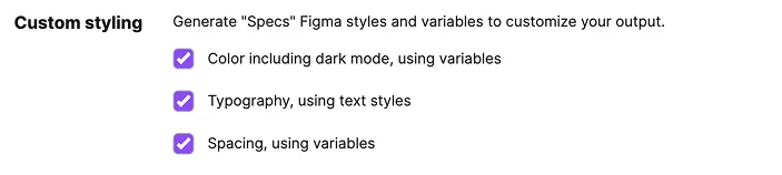
Open the plugin’s Settings tab and check “Spacing, using variables” under Custom Styling, then generate as usual.
What It Includes
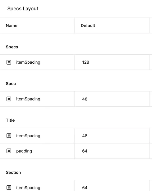
- Specs Layout collection — creates or reuses a
Specs Layoutvariable collection, hidden from publishing, with a singleDefaultmode - Number variables — one variable per internal spacing or padding role the plugin uses to arrange its own output (e.g. item spacing between specs, sections, and titles; padding within title blocks)
- Full coverage — every one of these internal spacing values binds to a variable instead of a hardcoded number
Variables You Can Customize
Each variable is named for the role it plays in the plugin’s own output — not the spacing of the component you’re documenting — grouped by the part of the spec it spaces out.