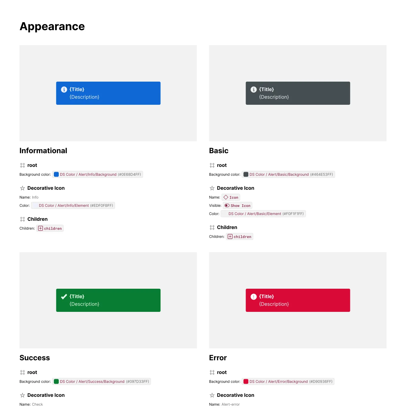
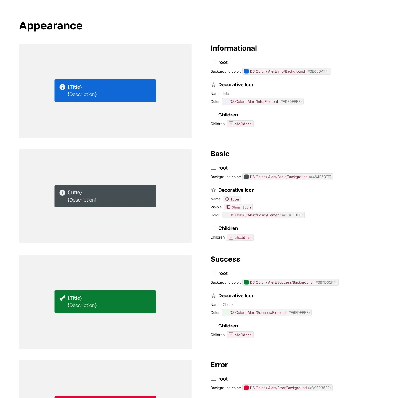
Multi-Column Layout
Multi-Column Layout controls how exhibits are arranged within a section or subsection — stacked one after another in a single column, or tiled into a grid of 2, 3, or 4 columns. It applies wherever exhibits appear (Anatomy, Props, Layout, Modes, Styling), so a single setting reshapes the arrangement across the whole spec.
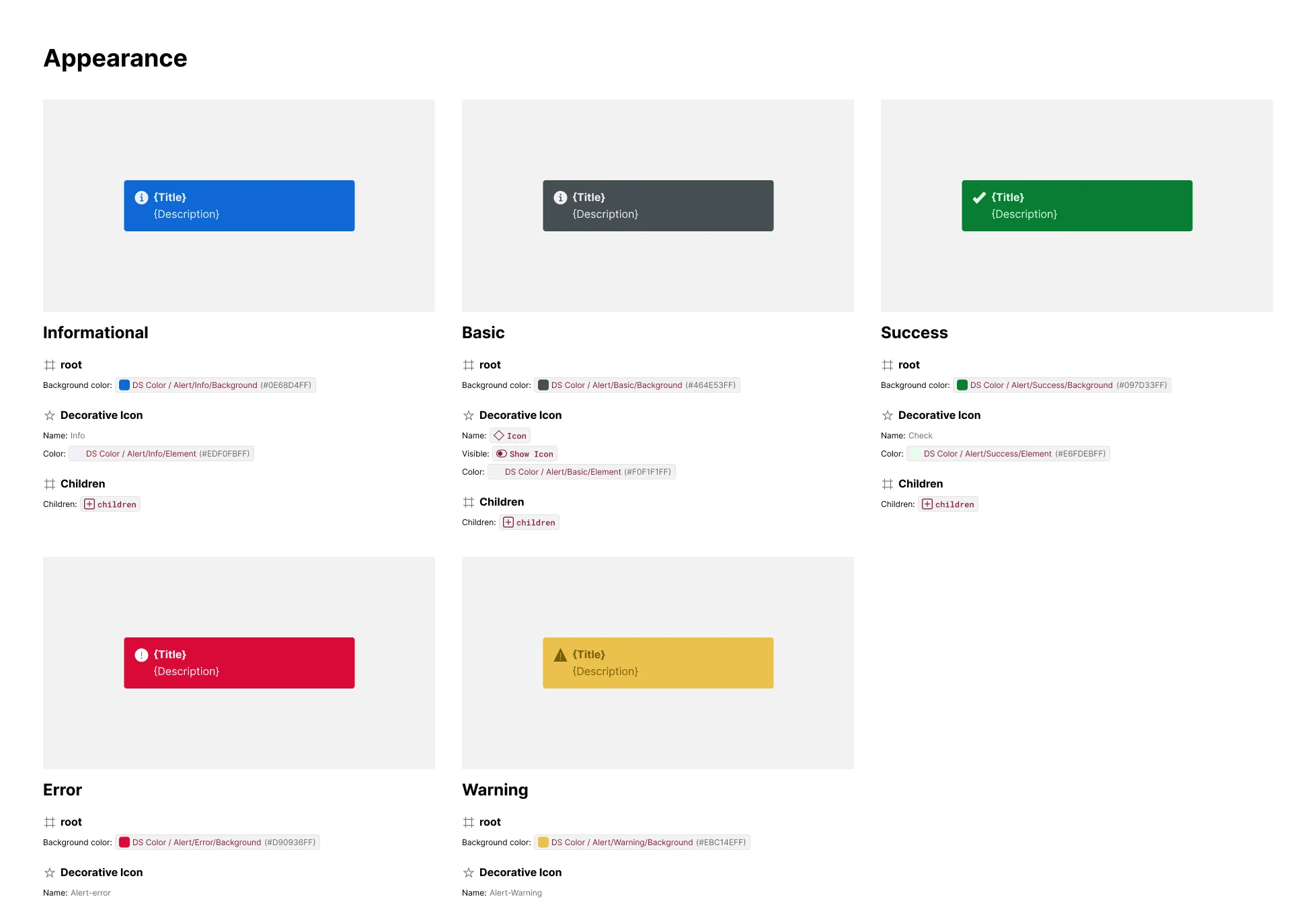
What It Includes
- Column count — choose 1 (single column), 2, 3, or 4 columns; applies to every section built from exhibits
- Native Figma Grid — multi-column output uses Figma’s own Grid layout, so columns hug their content and reflow the way any Figma grid does
- Artwork/content orientation — a single column keeps each exhibit’s artwork and content side by side (artwork left, content right); 2+ columns stack artwork above content within each exhibit instead
- Uniform column widths — after generation, all gridded artwork and content frames are normalized to a shared width, so columns line up evenly instead of hugging their own content unevenly
Examples
Single Column (Default)
With the column count left at 1, every exhibit lays out horizontally — artwork on the left, content on the right — stacked one after another down the section.
Multi-Column Grid
Setting the column count to 2 or more switches exhibits into a Figma Grid: each exhibit stacks its artwork above its content, and exhibits tile left-to-right, wrapping into additional rows once a row fills. Column widths are normalized afterward so every column lines up evenly, regardless of how wide any single exhibit’s content happens to be.