Props
The Props section provides a canvas-native reference for every property, including a properties table, per-property variant exhibits, and combined boolean/slot exhibits.
What It Includes
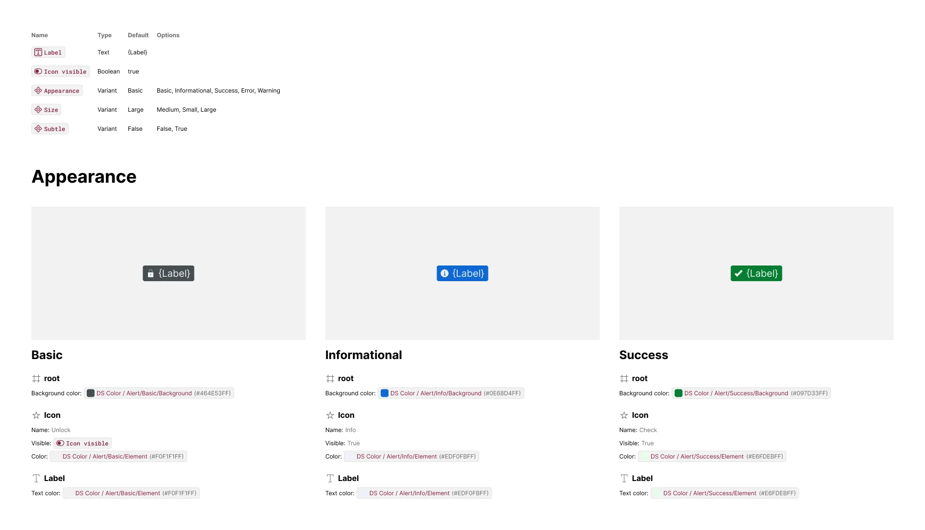
A properties table sits above the variant exhibits, listing every prop by name, type, default value, and (for variant props) its full list of options.
A variant example is emitted for every variant property, with one exhibit per non-default option. If a combination of two or more variant properties introduces new styling or bindings, an additional exhibit is emitted for that combination. Boolean and slot props are grouped into a shared “Additional properties” grid, with one labeled exhibit per prop.
The artwork includes:
- Component instance — configured to show the component with that property signature relative to the default
The content includes:
- Elements — for each element that changed from the default
- Attributes — of styles like color, size, corner radius, strokes, effects, and typography different than the default
- Bindings — of text, boolean, instance swap and slot props different than the default
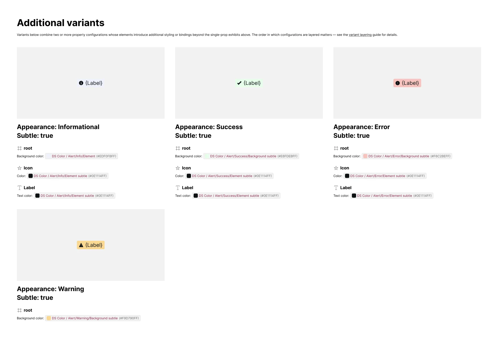
Additional variants and properties subsections are included whenever a combination or prop introduces style or binding changes. The content of that variant then expresses what’s different for that variant relative to all the matching variants shown prior.
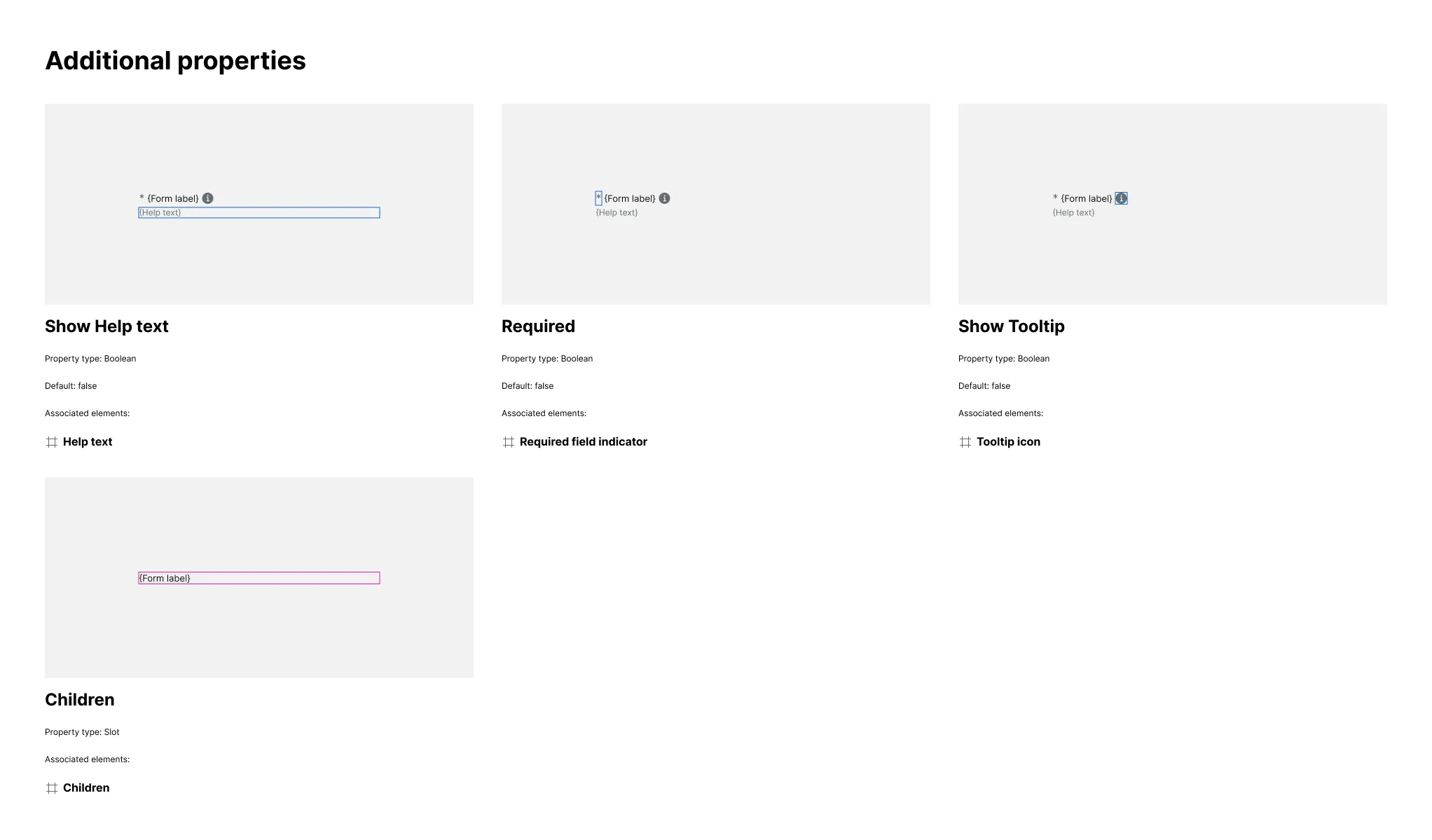
Boolean and slot props tile into a shared “Additional properties” grid, one labeled exhibit per prop, each showing the property set to true (booleans) or its slot outlined in place (slots) with the associated elements listed underneath and highlighted in the artwork.
Related Settings
- Details — FULL renders only the properties table; LAYERED adds variant exhibits
- Variant Depth — Limits how many variant property dimensions get their own subsection
- Invalid Variants — Includes otherwise-invalid options as placeholder exhibits per property
- Invalid Combinations — Determines which multi-prop states appear in Additional variants
- Empty Variants — Includes variant exhibits that show no differing elements
- Code-Only Props Pattern — Adds hidden behavioral props as rows in the properties table
Examples
Additional Variants
Components with several variant properties get one subsection per property, each with its own set of exhibits. If any variant combines two or more properties in a way that introduces additional styling or bindings, those combinations get their own “Additional variants” exhibits.
Booleans and Slots
Boolean and slot props don’t get their own variant subsections — instead, every boolean and slot prop on the component tiles into one shared “Additional properties” grid, each exhibit outlining the associated element in blue (booleans) or magenta (slots), with the associated element named underneath.